
Mock project for testing the branding layout. Fernway is an invented brand; the identity had to feel calm, modern and easy to recognise at any size.
The brief
Invented brief. The old identity was a wordmark in a default typeface with no colour system, so every piece of marketing looked like it came from a different company.
Logo



Colour
Primary
#07071E
Secondary
#363682
Accent
#C7C2FF
Background
#F5F4FF
Typography
Typeface
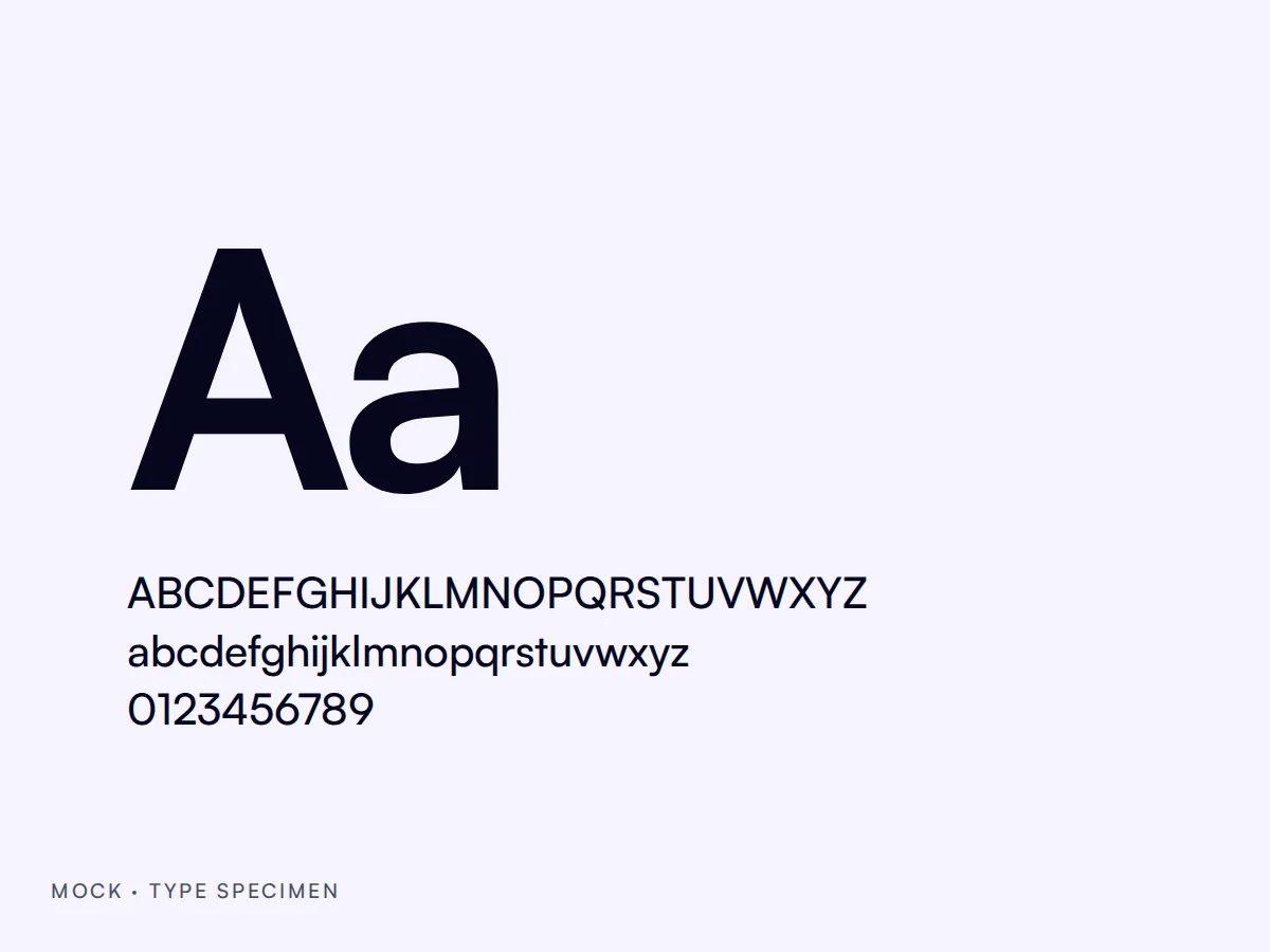
Satoshi
A clear geometric sans serif that stays legible on packaging and on screens. Bold for headlines, Regular for body text and the interface.
In use
Deliverables
- Logo suite
- Colour system
- Typography
- Brand guidelines
- Social templates
- Motion toolkit